Magazine
Design incorporates objects, people,
ideas based on the small pleasures of everyday life.
Meet your wonderful design world with the DDP Design Fair.
The World’s Most Famous Soup Can is Getting a Redesign for the Digital Age
Campbell’s Soup prepares for the era of metaverse with its new packaging design
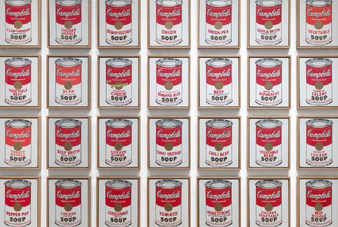
The Campbell’s soup can, which was transformed into a work of art by American pop artist Andy Warhol in 1962, redesigned its packaging for the first time in 50 years.
Just as a vast array of products are neatly organized to arouse consumers’ visual attention and desire and make them experience vertigo with infinite freedom of choice, 32 types of Warhol’s Campbell’s soup cans wrapped in red-and-white paper labels present a gratifying moment when the boundaries between a supermarket and a gallery become unclear.
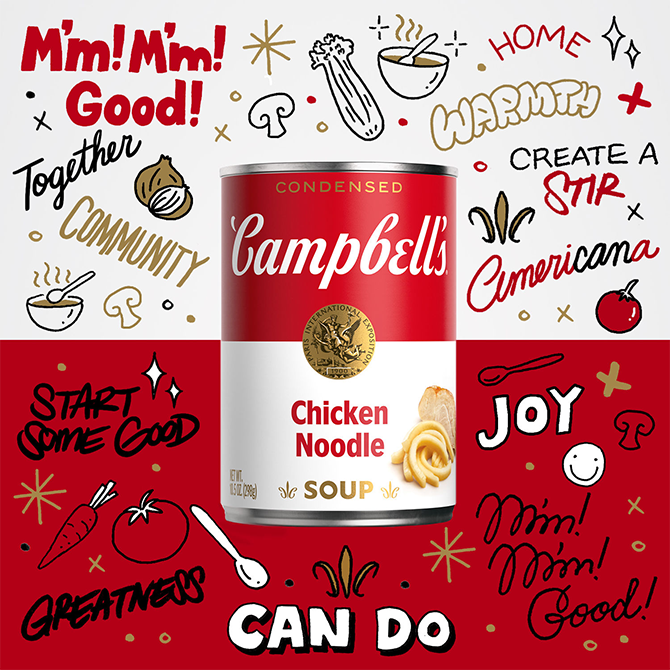
On July 27, 2021, Campbell’s Soup Company unveiled the refreshed label design of Campbell’s Soup and dropped 100 pieces of limited-edition digital art with NFTs (non-fungible tokens) based on the redesigned label via OpenSea, a marketplace for digital art.
The logo was redesigned by graphic designer and illustrator Sophia Chang. The “O” slanted to the left from the “SOUP” font in Campbell’s soup label was positioned upright and changed to a two-dimensional capital letter in gold. An image that represents the taste of the soup was also added to the side. For example, the label of Campbell’s signature tomato soup can includes an image of a tomato. Campbell partnered with Ntwrk and Aerial to convert Warhol’s Campbell’s soup cans into NFTs.
| 이전글 | Stamp, A Record of Historical Events |
|---|---|
| 다음글 | Reading the Hidden Power of Space Design from SPA Brand Stores |
Family Site


Copyright ⓒ 2024 ddp design fair. All Rights Reserved.